
 EN
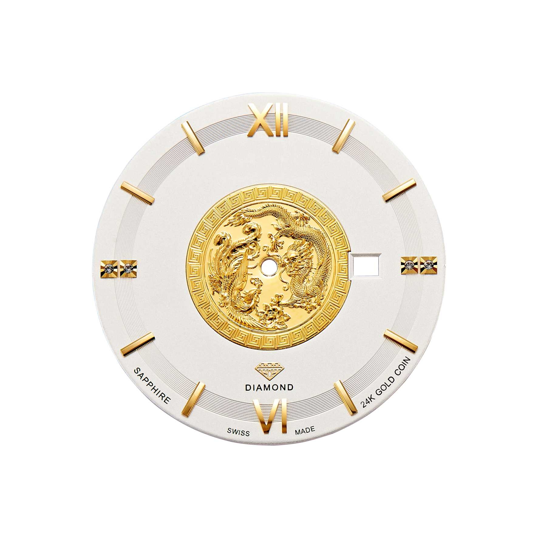
The Pattern Is Never Just a Pattern
A dial’s texture often catches the eye before the hands or case. Under a loupe, a guilloché surface breaks into repeating grooves. A sunburst dial throws light from center to edge. In watch dial manufacturing, the visible pattern comes from a chain of decisions about substrate, cutting method, surface prep, and coating. One weak step and the pattern disappears under lacquer or reads as noise. Dial texture is rarely one operation. It is a sequence that must agree at every handoff.
Guilloché Comes in Three Distinct Forms
The term guilloché is used loosely. The pattern is a set of repeating geometric lines, usually spirals or waves, cut or pressed into metal. What separates a guilloché dial from another is not the motif but how metal moves.
Hand engine turning cuts metal with a fixed tool while the work rotates. Grooves get a sharp floor and clean walls. CNC machining uses a rotating cutter and leaves fine milling marks. Stamping presses a die into the blank, so metal deforms rather than cuts. Under magnification these surfaces differ, and they handle light differently. Stamped patterns can look softer. Cut patterns tend to hold a harder highlight.
That matters when specifying a guilloché dial. A brand seeking crisp engine-turned reflection asks for a different process than one needing a repeatable pattern at higher volume. Neither is automatically better. Tooling and cycle time follow the choice. A stamped and a cut guilloché dial can share a motif and still read as different products.
Sunburst and Circular Graining Demand Tight Geometry
A sunburst finish looks simple: fine radial lines from the dial center. The effect depends on how an abrasive tool meets a rotating blank. The dial spins while an abrasive-loaded brush or pad contacts it, so lines run center to edge. Uneven pressure or abrasive breakdown turns a sunburst finish patchy and dull. Under galvanic color, those flaws become more visible.
Circular graining uses concentric circles, often tightly spaced. On a dial it appears on subdials or recessed counters rather than the main plate. It can be applied on a lathe, so decoration follows machining. The risk is concentricity. If circles are not centered on the functional axis, the pattern fights printed markers and applied indexes. A sunburst finish is judged by clean radial lines at the edge; circular graining is judged by a steady center.
A production example: brass blanks were machined and grained, then sent to galvanic coloring. After plating, a faint off-center shift appeared in subdial circular graining. Graining looked acceptable before plating. The cause was a fixture with small runout during a long cycle. Because graining was concentric with the fixture, not the final center axis, the error showed only after color contrast and printed markings were present. The fix was a fixture check, a re-centering step before graining, and a dimensional checkpoint after machining.
Stamping and CNC Milling Fit Different Jobs
Stamped dials start with a die. Pressing forms functional relief such as recessed counters, flanges, or raised numerals, plus decorative geometry. Stamping suits repeat runs and can hold a consistent surface across a large batch while the die stays in condition. The limit is deformation. Very fine, sharp-bottomed grooves are harder than with cutting, and die wear softens the pattern over a long run.
CNC milling gives more direct control of tool path. Complex outlines, recessed tracks, and stepped features can be cut in one setup, reducing handling and re-fixturing. The trade-off is cycle time. A machined guilloché or engraved dial is slower per piece, and the surface carries directional tool marks unless a finishing step removes them.
| Attribute | Stamping | CNC Milling |
|---|---|---|
| Pattern formation | Die impression, metal deformation | Rotating cutter, material removal |
| Surface character | Softer groove edges, diffuse reflection | Sharper cut, visible tool path |
| Tooling lead time | Die fabrication required | Programming and fixture setup |
| Per-piece cycle | Fast once die is proven | Slower, especially for fine detail |
| Best fit | Repeat patterns, volume, formed relief | Complex geometry, tighter dimensional control |
| Main wear point | Die condition over long runs | Tool wear and fixture stability |
Neither column wins across the board. Deep formed relief with a repeating motif may suit stamping. Intersecting guilloché with a tight marker seat may lean toward milling. Many dials combine both: base geometry, then a separate decoration pass for the visible surface.
Plating, Lacquer, and Printing Decide Survival
A freshly cut or stamped texture is only half the story. The visible surface is built in layers. Before lacquer or paint, the blank often receives galvanic treatment such as rhodium plating or gilding, or a PVD coating, to set base color and reduce oxidation risk. Lacquer layers follow, sometimes several, and the surface may be polished flat between coats. Pad printing comes after the base color settles, and applied markers are set into position.
Each layer changes dial texture. A heavy lacquer coat can fill fine grooves and mute the pattern. A thin coat preserves detail but may not hide substrate imperfections. Plating can amplify a scratch or polishing direction invisible on bare brass. Pad printing adds a tolerance stack. Multi-color printing transfers features in separate steps and introduces registration variation between pads. If pad printing is slightly off, a printed chapter ring or logo will not sit cleanly against the grained or guilloché surface, and the dial reads as misaligned even when each operation passed its own check.
Dust is another quiet killer. A particle trapped under lacquer or between plating layers creates a visible bump or shadow that no pattern refinement can hide. Dial painting and lacquering are often done in controlled-atmosphere booths with filtered air and slight overpressure. That environment is a process requirement, not a marketing detail.
Incoming inspection catches issues that cannot be fixed downstream. A practical dial check reviews color consistency across the batch, pad printing registration, logo position relative to the center axis, plating condition at edges and holes, and dust, scratches, or blistering. A blister under plating is localized loss of adhesion, and once it appears the part cannot be reworked into a good dial. The same goes for a filled guilloché groove or a sunburst finish gone patchy under color.
Texture Consistency Is a Process Control Question
A dial pattern that looks right on one sample and drifts on the fiftieth piece is usually not a decoration problem. It is process control. Stamping dies wear. CNC fixtures develop runout. Plating bath chemistry shifts. Pad printing pads compress differently over a run. Variables that affect dial texture live across several operations and interact.
Sourcing model matters. A brand can use multiple specialized suppliers for blank forming, decoration, plating, and printing, coordinating handoffs internally. That path offers flexibility and access to specific crafts, but the brand owns interface risk: a texture approved at the decoration supplier may not survive the plating supplier’s process window. Alternatively, a single-source components partner can hold the dial through the full sequence, from blank machining through graining, plating, lacquer, and pad printing. That model reduces process handoffs and makes it easier to lock a texture standard across a batch, but it concentrates responsibility and often raises the minimum order threshold because setup work is shared across the run. Neither model is universally correct. The choice depends on how much coordination a brand wants to own and how tightly the texture specification must be held from piece to piece.
Texture consistency is measurable. Dimensional tolerances on dial features can be held to ±0.05 mm or tighter on critical fits. General dial tolerances in chronometer submission specifications run around ±100 μm, with concentricity tolerances on the hand axis in the same range. Those numbers do not describe the visual pattern directly, but they describe the geometry the pattern sits on. If dial feet, center hole, and marker seats are not held, the most carefully executed guilloché will still look wrong once indexes are applied and the dial is cased.
For brands developing a dial with visible texture, specify the pattern by process and surface character, not just a reference image. A photo cannot tell a stamper whether the original was cut or pressed. A line callout, groove depth range, surface roughness target, and plating sequence give a dial maker something to hold across production lots. A guilloché dial with visible texture needs that process language, and so does a sunburst finish that must stay consistent under lacquer.
Burriva works at the component level on dials, cases, bracelets, and buckles. Textured dial projects can move through blank machining, graining, plating, lacquer, and pad printing as one controlled flow, with dimensional inspection and multiple inspection rounds tied to the features that texture depends on. Segregated workflows and CAD file access controls keep design data separated by job role. Brands with a specific guilloché, sunburst, or circular-grained surface can contact the team to discuss dial specifications and inspection points.